Change the Color, Change the Story
Change the Color, Change the Story
The Fastest Way to Transform Your Photo’s Mood
Table of Contents
Color Perception
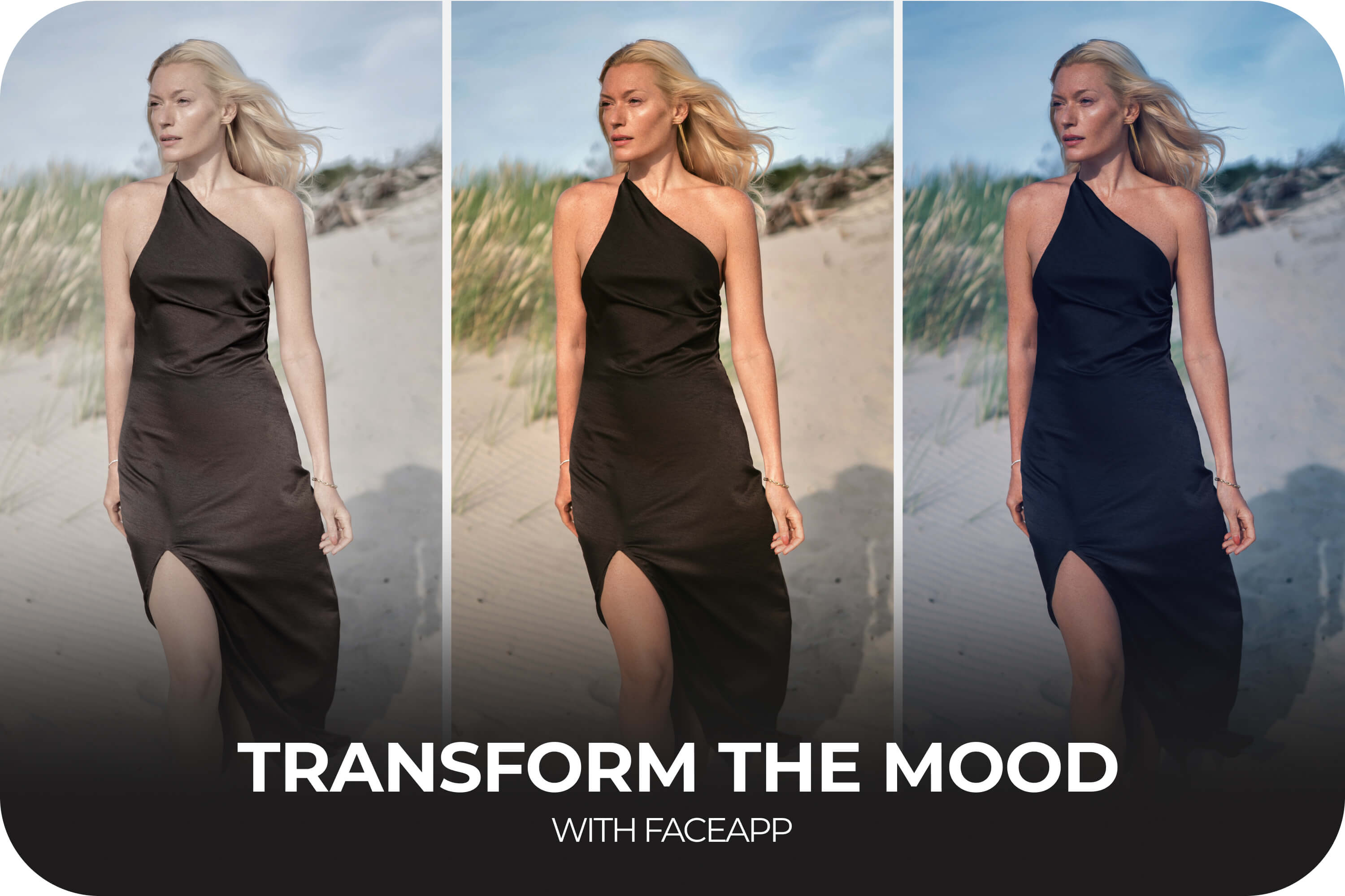
Color shapes perception faster than composition or detail. Warm tones are often associated with comfort, nostalgia, and intimacy. Cooler tones suggest calmness, distance, or mystery. Higher contrast can add drama and tension, while softer shadows create a lighter, more open feeling. Even small shifts in saturation influence how energetic or subdued a photo appears. This is the foundation of color grading photos, that you luckily don’t have to master yourself.
Adjustments
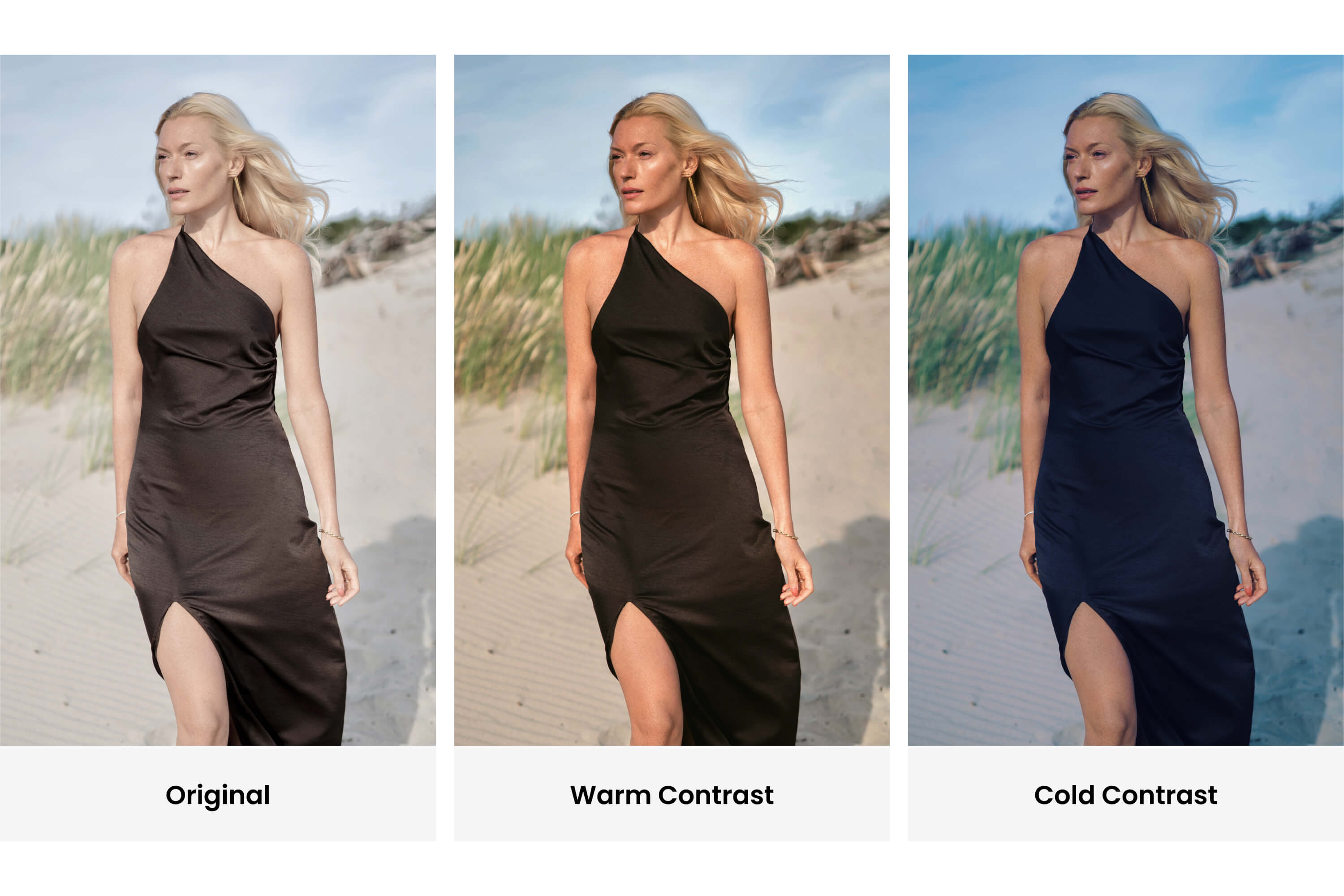
Many creators avoid color grading because it sounds complex. It’s often associated with professional software and detailed color theory. But in practice, effective photo mood editing usually comes down to a few intentional changes. You will find everything you need in the Adjustments folder. So, open the Adjustments folder and start with fixing temperature. A slightly warmer image can feel inviting and optimistic. A cooler one instantly becomes cinematic or introspective. Next, look at contrast. Deeper shadows and controlled highlights can create subtle cinematic photo effects without overpowering the image. Adjusting saturation carefully helps emphasize mood without making colors unrealistic. The key is subtlety. A small shift in highlights can make a portrait feel sunlit and fresh. A gentle reduction in saturation can create a refined, editorial tone. These adjustments don’t need to be dramatic to be effective.
Filters
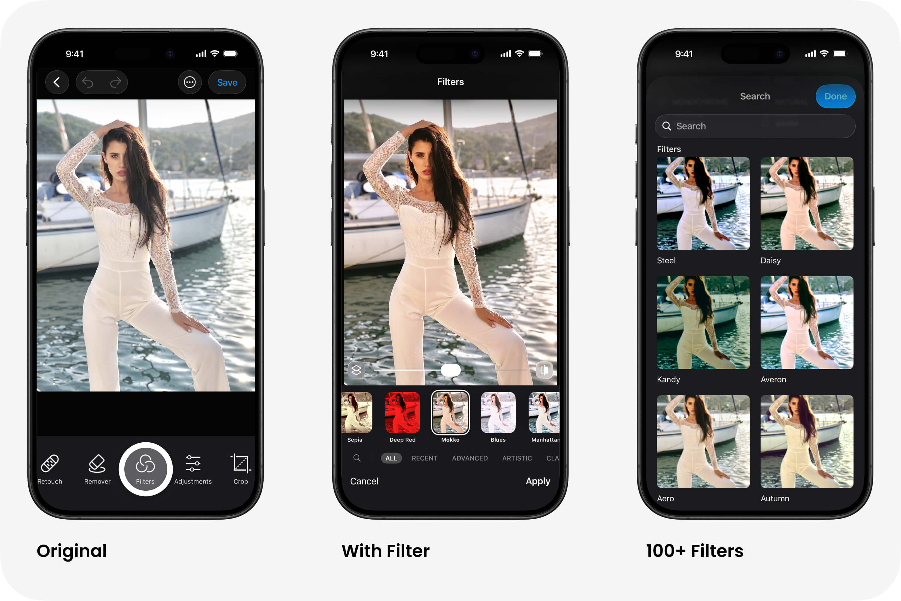
To see how multiple filters would look on your photo, tap the search icon and scroll down.
With tools in the Filters folder, experimenting with color becomes intuitive. Color Filters provide ready-made mood foundations, while simple tone sliders allow quick refinements. Instead of navigating complicated manual controls, users can instantly transform photo mood and explore different atmospheres in seconds. That’s the real power of creative color grading: it changes how a photo feels without changing what happened in it. You don’t need advanced knowledge to make your images more expressive. Often, the difference between an ordinary shot and a cinematic one is just a thoughtful color decision — applied quickly, confidently, and with purpose.
FAQ
Q: Do I need advanced knowledge to color grade photos?
A: No, you don’t need advanced knowledge. Simple adjustments and filters are enough to create expressive results.
Q: Where should I start when editing a photo?
A: Start with temperature, then adjust contrast and saturation to shape the mood.
Q: How can I make my photos look cinematic?
A: Use cooler or warmer tones intentionally, control contrast, and keep adjustments subtle.
Q: Are filters useful or should I edit manually?
A: Filters are a great starting point, and you can refine them with small manual adjustments.
Q: What’s the most important rule in color grading?
A: Subtlety — small changes often have the biggest impact.